How do you pronounce ✺?
Our eye skips over it, hungrily searching for the next letterform, for a foothold. Or perhaps, we pronounce its ambiguity, registering the mark’s meaning as pliant, but not speakable. It’s a hitch, a stutter, a moment where the textblock itself briefly flutters into focus—if only for a second.
Glyphs do this. They tuck their meaning within bezier points, pixels, and light. To define them, one gropes at metaphor. Jacques Derrida pointed to the parergon, those elements that are "neither work (ergon) nor outside work,” to account for just these moments. The frame, silverware, scaffolding — all feel alike in their obliqueness. In short, they only make sense in conjunction with a system, the same way an asterix is only additive if there’s something added.*
Of all of these figurations, the glyph readily invites metaphor. After all, to traffic in language is to traffic in type, a close cousin of ✺. That said, the ambiguous space of shapes, kerning, punctuation, and unicode deserves not simply pronunciation, but an audit. Cozying up to the glyphic invites a study of not only its own “parergons”—the punctuation that governs punctuation—but also its complicity outside of language.
Glyphic*ism approaches the glyph as a mark of immense personal, formal, and commercial force. As such, this thesis hopes to raise the glyph as a totem pole, open it like an umbrella, and dig up its guts in the Atacama desert.
*It would be strange if there was no note.
.png?v=1600826306390)
This semester, the glyph has emerged as a productive site for making, and from this territory, I've begun to build my thesis and practice, which I'm currently calling "Glyphic*ism."
What does this mean? What does a glyph offer that symbols, icons, or alphabets cannot? What even is a glyph?
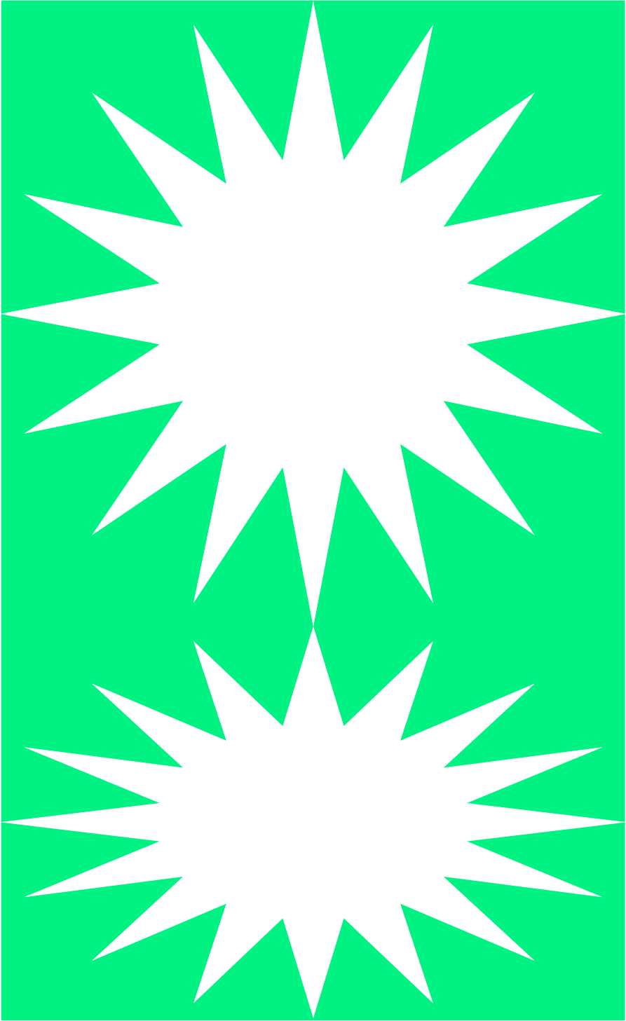
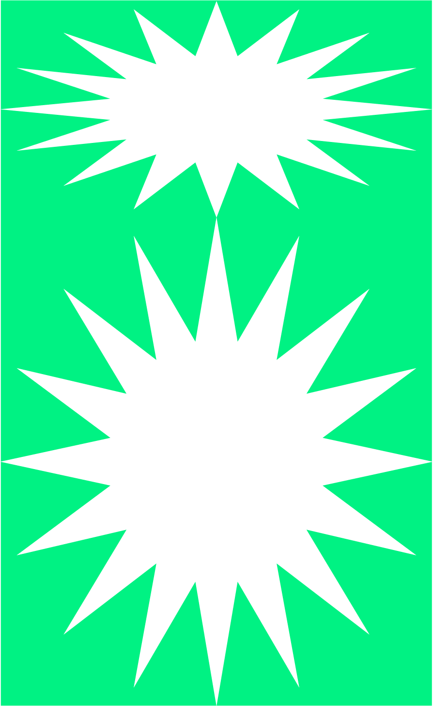
Like most designers, when I picture "glyphs" I immediately imagine this window, a hidden grid tucked behind or beneath the font-file. This awkwardness interface fits the awkwardness of the term itself: the glyphic suggest typographic forms beyond the alphabet. Florets and geometries and doodles and (my favorite) starbursts all wait patiently in that window, contextless, their meaning contorted (and confined) by Bezier Points.
Alienated from the world of word construction, the humble glyph slips into a more digressive space, one definitely public but confused; abstract, but instantly imbued with meaning; commercial, but only tenuously so. You might imagine looking at Raymond Loewy's Shell logo long enough and seeing not a brand, but pure contour.
I want "Glyphic*ism" to work with the grain of this ambiguity. Fittingly, an asterism, a constellation of figures, might best contain this practice.
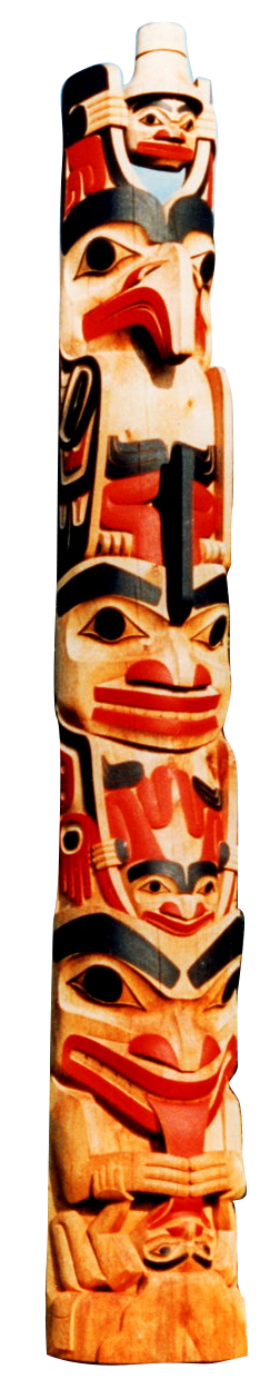
Paul Klee, Robert Davidson, Kris Sowersby, John McPhee, Ellsworth Kelly, and Christo—they each use typographic form to capture oblique meaning, the range of expression outside words, but also outside art.
The indigenous artist,
Robert Davidson
is perhaps best known for raising the first totem pole in ninety years
on the island of Haida Gwaii. His work abuts typography—and his
practice resembles the nuanced gestures of calligraphy or type
design—however, I personally respond to the richly human chain of
tradition that informs the direction of his adz or brush. His glyphs
(trout masks, bear faces) communicate generously and outside an
immediate linguistic register, and yet it feels didactic to call his
work fine art.
Kris Sowersby (who I also hope to interview for this thesis) approaches his type design with a similar fluency, attending to the digital medium as one would a block of wood, carving meaning and space with an expertly teased Bezier.
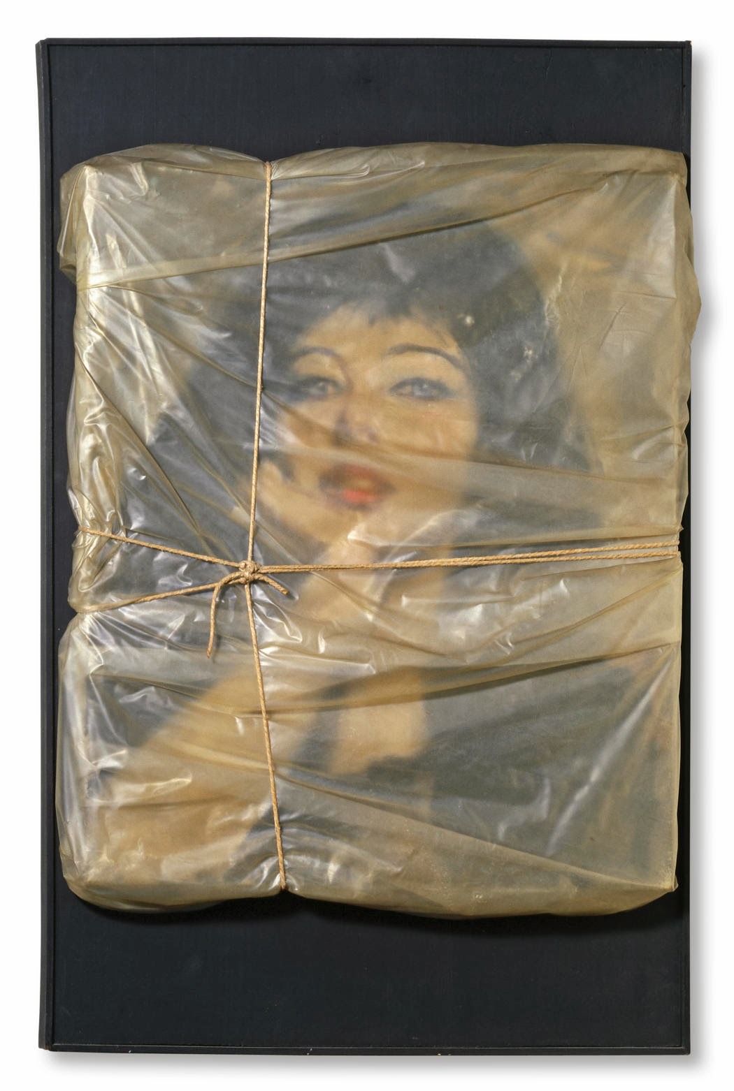
It felt natural to build a typeface to celebrate Christo's work—its bulk, its dimensionality, its drapery. The final variable form includes not only a weight axis, but a perspective axis as well. The web specimen allows the option to explode the cover, to test the dimensional. It also place the bandy regular weight in conversation with the extreme ink traps of the display. In this spaces, I had the letterform fold inwards to evoke the character of Christo's wrapped works.
When you stare long enough at any glyphic form, you begin to see it for the first time, free from from its own the thicket of meaning. Take a ribbon of stock ticker tape. In these arrangements, the pulse of a virtual marketplace beats. This graphic residue, along with the looming economic recession, prompted me to newly consider the "share." The current glyphs around the financial system carefully, as David Graeber puts it, maintain "systems of coercion...that turn the products of human cooperation, creativity, devotion, love, and trust back into numbers once again."
These unwieldy glyphs render a market.
To re-imagine this terrain, I began my research by building a website containing the other ephemera associated with the world of finance and (inevitably) debt. In the process, the In Debt/Index traces money as an essentially glyphic form, one that converts exchange into a cold language of $,€,and ¥.
I next designed a set of my own variable glyphs. While these served initially as interpretations of the stock-market's graphic material, they, like all glyphs, opened up me as "characters," free to be used elsewhere.
With my new character set, I built Stock-Poster, which uses an API to convert any stock into poster components. Like a stock ticker, these are algorithmically reactive to your input stock. For instance, we might insert the stock for the company that manages my student debt (Nelnet or NNI), and animated "stock poster" pots out, one laid out and moving according to the obscure fluctuations of the market. It can then be saved and printed or projected, all of which I plan to do more of over winter session.
It's difficult to remember that the US Dollar is made of textile, not paper. That it can be stamped out in the U.S. Bureau of Engraving and Printing. That threads laden with microscopic symbols are woven into the cotton pulp. That a glyph, the EURion, might make the forms unscannable. That the pyramid, that the eye of Providence, meant something to someone. That the ink might stain your fingertips.
Currency is a collectively agreed-on fiction, but that seems uncomplicatedly true. What's far stranger is how little investment Americans have in the craft of that fiction.
This seems like a bold claim (especially considering how often we think about money), but really consider a dollar bill, or an invoice, or a contract—do you really feel anything for their particular arrangements of glyphs on the page? Does the eye of Divine Providence mean anything to you? It means nothing to me. We're living in a post-gold standard world, one tumescent with speculation and symbolism. In its financialized space, the US dollar acts as a fiat cipher, a marker of alienation. And in the age of credit, even that seems like an anachronism, the 8-trak tape of transaction.
To take serious a bank note forces one to take seriously its glyphic space (as Oxenaar did). I decided to build my currency virtually, to adopt this antique form as a medium to explore a globalized economy.
To make my own Automatic Teller Machine, and circulate bank notes with their own glyphic meaning, time stamp, and value.
This visual research helped me rethink some other projects, including Grid Grammar. This website converts grammar into (naturally) glyphs, which can then be deciphered with a provided key. It helps me reinterpret English's positional character as a pattern strategy: a sentence as a conditional design prompt.
More straightforwardly, I took a moment this semester to celebrate MAS's return to power in Bolivia. I aimed to transform the Wiphala (Wife-ala), the flag of both the political party and the indigenous population into a set of massive posters capture this particular victory for international socialism.
Finally, I've revisited my Dropdown Essay, which uses the dropdown menu to unfold possible readings from a single text, using the language of ui to allow meaning to bifurcate and branch out from a single source. The unit becomes a network.
I've tried to capture the logic behind these projects in a single place, my current thesis website. I plan to draw from my Christo specimen to make the section openers and cover vary for each reader, allowing the opportunity to endlessly edition the book, a kind of glyphic timestamp on the thesis.
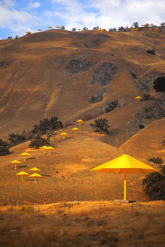
The Umbrellas were up for 18 days in 1991.
Of course I don't remember them, but my parents took me to the California hills, where we stood under contours of shadow.
Three weeks later, one of the 485-pound yellow umbrellas, pried loose from its concrete foundation by the wind, killed a spectator.
In 1985, Christo, his hair flecked with grey and his eyes pebbled behind thick glasses, explains to a gallerist his intent to wrap the Pont Neuf bridge for 14 days. With long spindly fingers, he insists that the bridge would, for a moment, "become a work of art, and then return to its original state."
The gallerist smiles awkwardly to the camera, waves with both hands, and backs out of the frame. "I love this bridge the way it is."
Across a table from General Jacques de Guillebon, Jean-Claude's father, Christo outlines his political gambit. Guillebon, the French war hero who led the Libération during WWII, reclines listening to his son-in-law's feverish attempts to wrap the Pont-Neuf. Incandescent yellow renders the whole scene baroque, mottled in shadow, ancient.
Christo: "What about Debré, who's really important to this Gaullist
party?"
Guillebon: "Pressure?"
Christo: "Not pressure..."
Guillebon: "Influence."
Christo's father owned a textile mill in Gabrovo, Bulgaria, where Christo would sketch the workers and machinery. His brothers called him "Don Quixote" as a child.
Behind the farmers and machinists who modeled for the students at the Sophia Art Academy, a Soviet star loomed. On weekends, Christo and the other academy students would paint propaganda for the Soviet state.
Years after Christo fled Bulgeria to Vienna to Geneva to Paris, General de Guillebon reminds dinner guests, across a platter of scrod, of Christo's courage to have escaped.
"Why is everything so political?" Christo complains to Jean-Claude in 1985. Over the television, Jacques Chirac had just sneered at the idea of wrapping Pont-Neuf.
Christo canvassed the Parisian people, going door to door, arguing that this public work would be vital.
Would be beautiful.
The umbrellas, the gates, the bridge, the mastaba—these geometries frame political campaigns, histories, and failures. Christo's scultures have a glyphic quality; in shape, he briefly situates meaning for a public. He needs people to agree on these pieces, not their value—those gathered around Pont Neuf debated the merits and utility of a wrapped object—but their existence.
It's the agreement that gets me. In Paris, he sits in cafés wearing all blue, his long limbs contorted uncomfortably into booths, onto barstools, a spider anxiously ensnaring gathered men and women, threading his case.
"All I know is I feel the need to wrap the Pont-Neuf."

Since @reggae_exe joined twitter in 2016, he has posted nearly every Friday an insistent question: "are you guys up for some reggae tonight?” Sometimes he drops the question mark. Other times, he types entirely in Greek script. He has included ascii images of cats dancing, eating, and sleeping to (presumably) reggae. He once staged an emoji car chase framing an allcaps “ARE YOU UP FOR SOME REGGAE TONIGHT.”
He gave the cat abs, once (Fig. 1).
The nearly 500 entries have now become a collection, an ode to absurdity, one that only registers as a body of work. A commitment to the bit obscures the original referrent, warping the one-note joke into something artful.
I recognized his phrase from somewhere, and its only after reverse-image searching @reggae_exe’s avi that I found it’s origins. A throw-away gag from Terry Zwigoff’s Ghost World (2001). Thora Birch’s Enid had just roled her eyes at “like the biggest idiot of all time,” who dimly asks, “Are you up for some reggae tonight?”
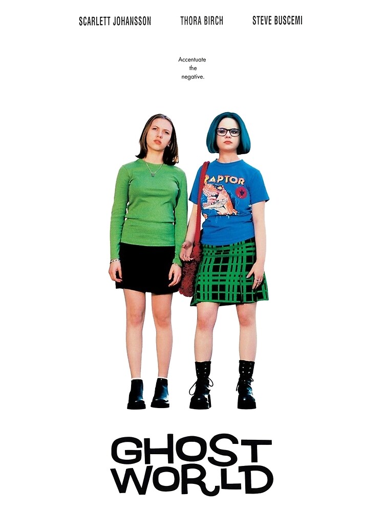
I saw Ghost World on IFC in 2003, on my parent’s red Ikea sectional. I remember only a few things about it.
It was a sad sunken eyes movie that captured the waning nostaliga for the 1950’s that so animated the 1990’s.
Zwigoff adapted the film from Clowes’ 1997 comic, which I picked up from a Barnes & Noble in Pentagon Row after seeing the movie. The comic section would have been near a set of windows facing out toward the Pentagon, because I remember the evening light across the comic as I read. SoCal contracted and expanded across each panel; Clowes’ linework was more graphic than expressive.
I might have been 14, and my twenties seemed as washed out as the comic's blues. The fact that they kept approaching warranted a snappy slacker scoff. More than I wanted to be Enid, I wanted to be in 1997.
Because 2004 sucked. The Iraq War remained insistently real, and culture kept insisting we listen to Maroon 5. Million Dollar Baby was America's only film, and "Pieces of Me" was America's ambient supermarket soundtrack. Barnes & Noble, with its redwood shelving, felt like the appropriate avatar for culture under the Bush administration: a bank for books.
Barnes & Noble felt like the internet, and the internet felt like the nineties, and the future felt like an eyeroll. Or maybe the space between the panels. Or maybe the bus stop where Enid waits at Ghost World’s end.
@reggae_exe isn’t interested in Ghost World, or 2001, or even reggae. He seems committed to only form, invested in contorting a single sentence into novel geometries, into expressions that did not exist as film or comics.
He's also not serious, which to my nostalgia-addled pain, makes him credible. His act of petty design offers a scrollable adaptation, one that flattens past, present, and future. One that makes something embarrassing a profound.
@reggae_exe is the angel novus.
The @reggae_exe is also a meme. Vinca Kruk and Daniel van der Velden
offer a succinct reading of the “meme” in their 2012 publication,
Can Jokes Bring Down Governments?. They trace the infectious character of these language viruses from
Richard Dawkins (who coined the term “meme”) to the weaponization of
“Rickrolling” to Tahir Square. In their essay “Meme,” Kruk and van der
Velden characterize how a meme transmutes a “collective memory” (35)
into a copiable form. They invoke the author Douglas Hofstadter to
characterize this form: “memes look a lot like self-referential
patterns.” (34).
Through feverishly repetition, @reggae_exe aims to strip “are you guys up for some reggae tonight?” of meaning and enter “some kind of strange loop” (34). Like Seth pundle in The Fly, he enters the teleporter, and emerges from the otherside, reconfigured: a buff cat.
While promoting his 2016 film HyperNormalization, Adam Curtis briefly described the new “memescape” of the 21st century. According to him, the internet resembles less the sepia green of the Matrix and more downtown Detroit in Robocop: a space populated by signifiers loosed from their signifieds. Mowhawked punks wandering from rusted factory to rusted factory. Hollowed-out storefronts. Both a utopian and dystopian future set in 1987.
Like those mohawked punks, graphic designer too must wander this bombed out “memescape,” hustling to make a living from images. Kruk and van der Velden’s further this reading, suggesting that “Graphic design is now a nameless collective of survivors of the (self-)destruction of paid labor.” (70). We are all trying to get by, and the internet offers designers a lonely territory for solidarity, a space where the “inessential” might take “some kind of center-stage.” (72). We’re all just trying to find some reggae together.
I started writing this essay on Wednesday March 11th. On twitter, someone posted Sarah Palin dressed like a muppet, singing Sir Mix A Lot on The Masked Singer. Chet Hanks, shirtless and heavily tattooed, recorded a message on Instagram letting us know that his parents, Tom Hanks and Rita Wilson, contracted COVID-19. Joe Biden just defeated Bernie in Michigan, and wandered out of frame during a virtual town hall meeting.
On Friday, RISD closed down. COVID-19 escalated into a pandemic, and @reggae_exe posted:
Was I up for some reggae? The meme persistently folds another moment into its complicated surface: Ghost World, and twitter, and the early 2000s, and the late 2010s, and now a pandemic.
Currently, my practice ticks like the reggae clock—a careful barometer of the absurd. How could I not make this work? I’ve been freed from the burden of a client. I don’t have to adhere to any pand guidelines.
I’m making “memes” for me.
I came to graphic design through Ezra Pound’s Cantos, through Anne Carson’s Nox, through W.G. Sebald’s The Rings of Saturn. Through Daniel Clowes.
I bought Cantos from that same Barnes & Noble in 2012. The interior hadn't changed at all. It remained endlessly virtual.
Their company still directs my attention, still comforts me. Which is what I hope graphic design might do now, as we enter a recession, a new uncharted memescape, a new future that will never arrive.
Alice Notley constructs arks, and trees, and eyes with words. Her poetry feels appropriate for our moment, “memeable” and collective. She points towards a future where we might become poetry, where language and image and self might intersect. She seems up for some reggae.


I tried to download a language today, but the servers were down.
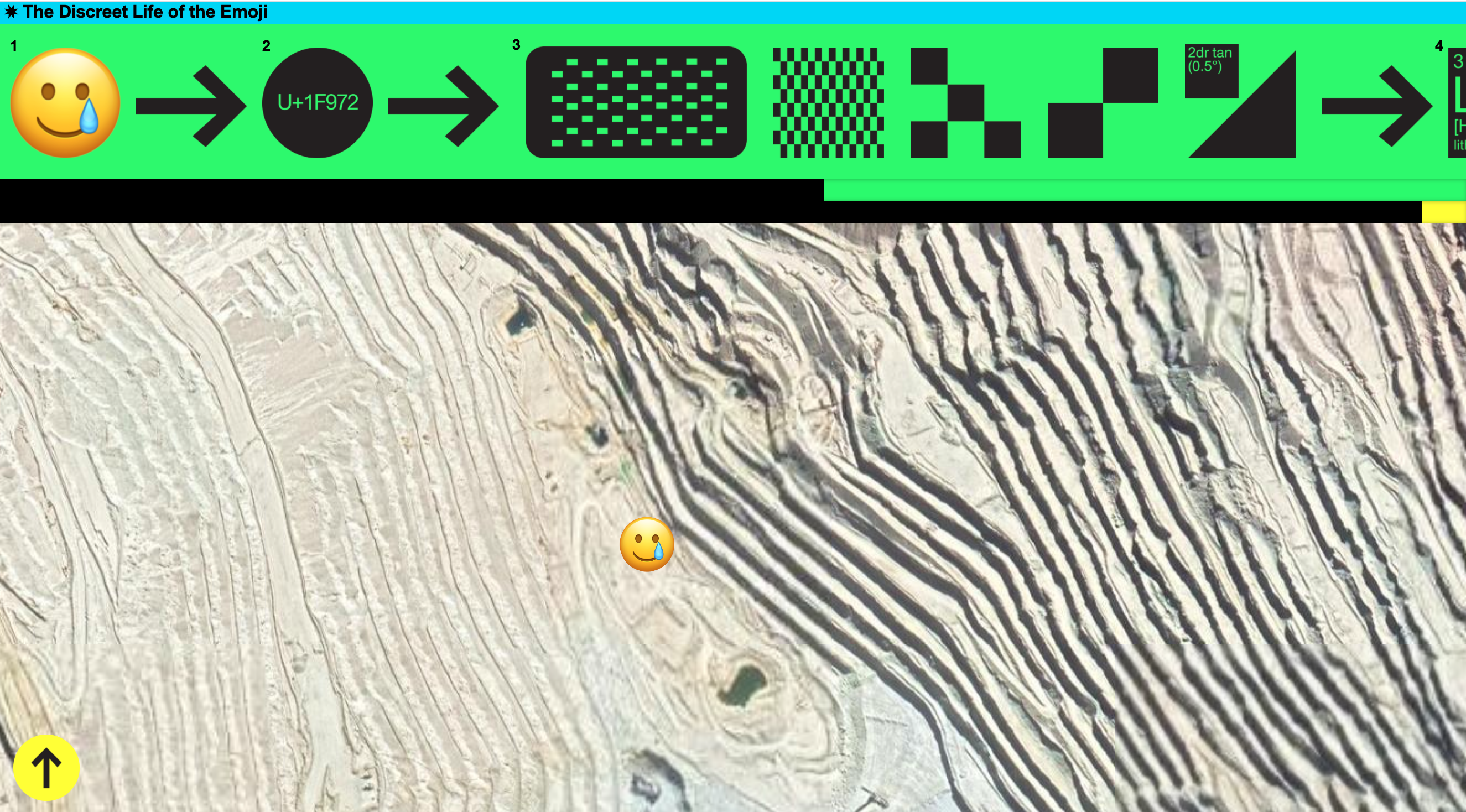
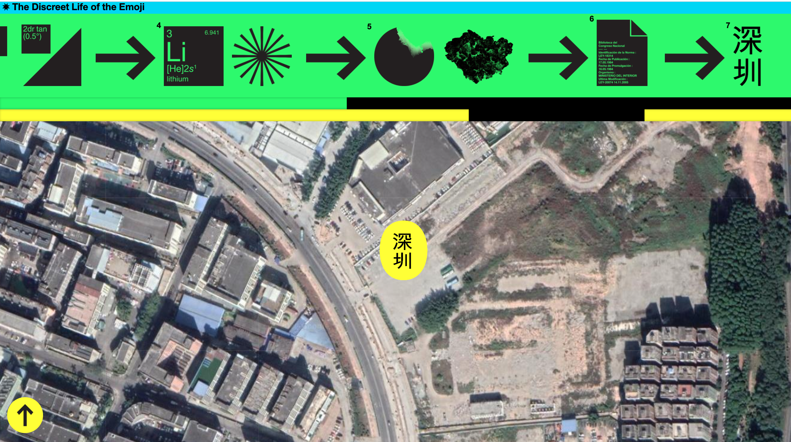
Since 1987, the Unicode Consortium has aimed “to unify the many hundreds of conflicting ways to encode characters, replacing them with a single, universal standard.” (4). This group of developers, designers, and programmers (it costs $75 to become an "individual" Unicode member, and $21,000 to become a "full" member) have steadily mapped a vast, linguistic expanse, building elaborate character codings to capture all known languages. From Glagolitic to Tagalog to Chorasmian to Elymaic to Sogdian , Unicode’s extensive character sets act as the symbolic infrastructure for the web—a seed bank for a globalized internet. That said, people most likely encounter Unicode not through Cuneiform or Dominos but through emoji.
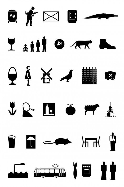
Like ARPANET , the precursor to the modern web, the emoji began with the weather. In 1999, the artist Shigetaka Kurita designed a set of 12- by 12-pixel images (Fig. 5)to show the weather for Japan’s main mobile carrier, DOCOMO. Beyond a sun, snowman, and umbrella, Kurita built a robust graphic vocabulary; he sneaked in a novel language to the internet. Not dissimilar to Isotype’s ideograms (Fig. 6).
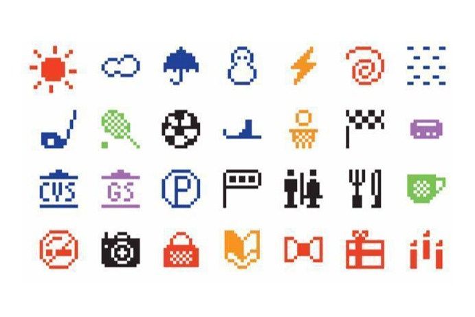
Kurita’s characters illustrated a familiar grammar; flatly 8-bit, these ur-emojis framed life in the late 90s: flip phones, playstation controllers, smiling cats, and Harry Potter glasses. These icons found an intuitive use: suddenly adding subtext to a message, adding voice, was as easy as a “heart” or a “frowning face.”
10 years later, a pair of Apple engineers, Yasuo Kida and Peter Edberg, submitted a proposal to Unicode, which adopted the first 625 emojis in 2010 including the 💩︎, widely thought to be the first drawn. By 2011, Apple operating systems integrated the emoji keyboard, allowing an efficient tool to proliferate novel usages of eggplants and broken hearts. Nearly every year since then, Unicode has added to their ever evolving image cache; there are now 3,304 total.
This year, Unicode 13.0 promised a set of 117 new emojis for the coming year. Knots, bell peppers, bubble tea, and potted plants—the Unicode blog laid out the symbolic terrain of 2021. I went to their site specifically looking for the teardrop smiley, a harbinger well-suited for a Biden/Trump debate, for another month of quarantine.
On April 8th, an announcement plastered across the Unicode site announced that in light of the Coronavirus, they would delay the release of Unicode 14.0 for 6 months. Then, 2 days later, their technical website experienced a catastrophic failure. Updates and downloads went dead.
It's strange for language to suffer an outage, but these past three weeks have felt fittingly silent. Under quarantine, I’ll stutter towards expression, wandering from livingroom to kitchen to bedroom, cycling through the familiar, unable to find the right words.
I want to say something with a bell pepper, but all I have are eggplants.
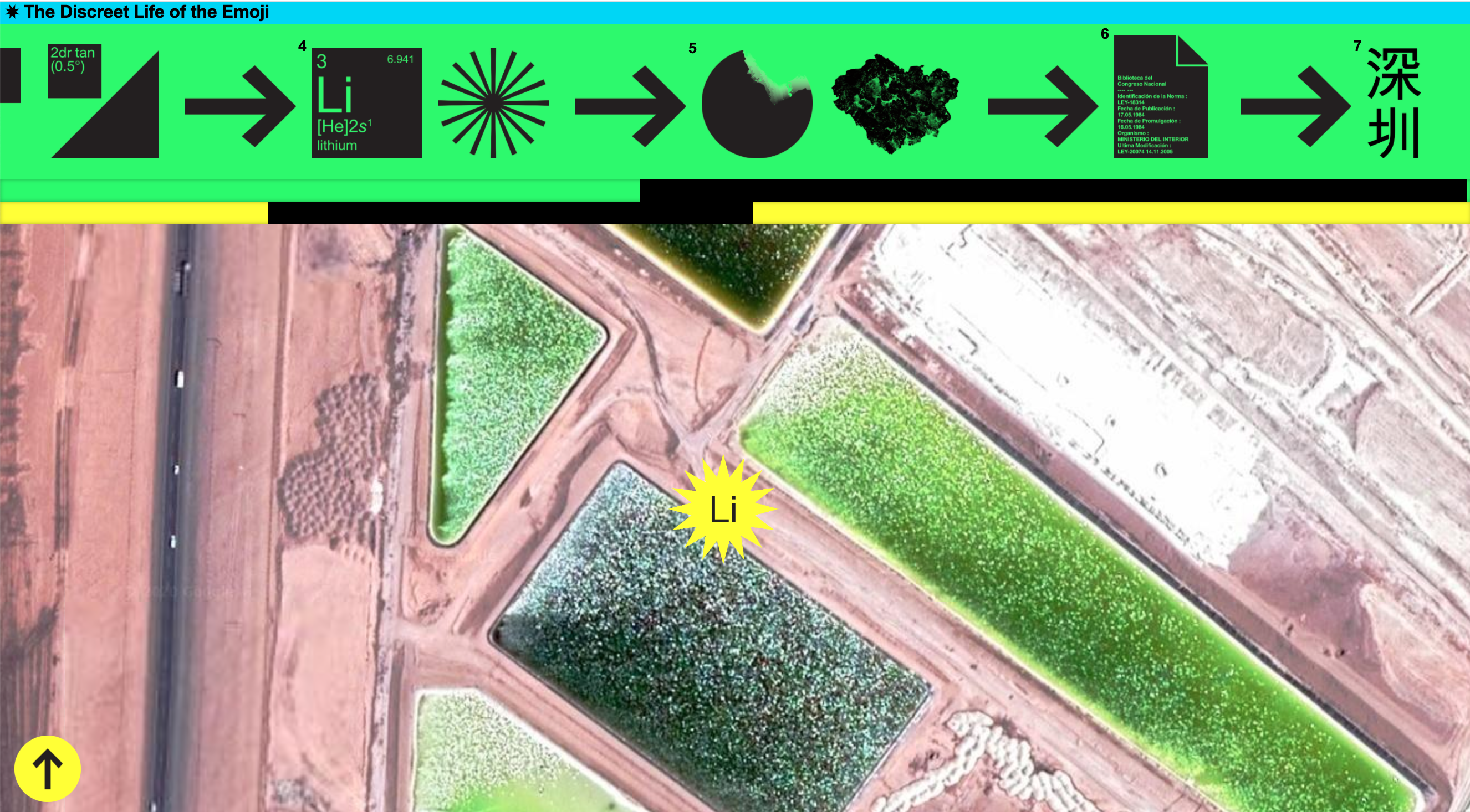
That digital bell pepper was grown in the Atacama Desert, where subcontracted faeneros mined the copper and lithium animating a globalized supply chain.
In Planetary Mine, the Chilean sociologist Martin Arboleda traces this extractive journey ⇢ from outside of Antofagasta ⇢ to the ports of Valaparíso ⇢ to the technopolis of Santiago ⇢ to the Apple factories of Shenzhen. By lubricating these channels, Chile has pursued “a new phase in the production of urban infrastructure” (131)—global capitalism’s dramatic expansion and emergent precarity. Chile’s aggressive push towards “port automatization” and “technological modernization” has dramatically destabilized the labor force,leaving an estimated 70% of the nation’s port workers under temporary contracts (131).
Out of these mineral supply chains emerges a “shadow economy of precarious laborers tasked with pumping dirty fuel out of tanks, collecting accumulated garbage and scrap, and cleaning used pipes.” (94). Many of those in this new precariat class used to belong to a “self-subsisting peasantry,” which the mining industry, bolstered by the state’s deregulatory practices, absorbed (97). The radical dispossession of a “global peasantry” fuels what Farshad Araghi calls a “planetary landgrab” (97), whereby subcontracted laborers gradually convert territory into minerals, products, commodities, and ultimately pixels.
You won’t find a “peasant” emoji on the Unicode keyboard. The closest you’ll get is a farmer 👨🌾 smiling blankly, a bushel of carrots poking into his frame. There’s no consequences to changing the farmer’s skin tone; he won’t have to contend with the colorism, death threats, or intimidation that indigeonous Chilieans now face as a result of the extractive industry (100).
For the foreseeable future, he’ll continue to resemble the agreed-on symbol a pluriversal supply chain reached. He’ll remain silent as programmers frantically reboot their Unicode servers, as the global economy contracts, as I wait patiently for the dodo (to be released as part of Unicode 13.4) emoji to describe the failed American state.
Graphic designers operate in a public.
How they draw its borders through circulation determines what puns land, which ironies glitter. There’s immense pleasure in this exchange; the same pleasure, I imagine, that Richard Rorty took in his philosophy, or Otto Neurath in his ideograms, or Unicode in their emojis. Reckoning with the agreements visual language asks of pluralities, of us, strikes me as a joyful practice: being part of a whole.
As my finger hovers over the emoji keyboard or slashes across a trackpad, I’ll think principally of Ellsworth Kelly. Kelly served in World War II as a member of the 23rd Headquarters Special Troops unit, known as the “Ghost Army.” In his division, Kelly helped to construct dummies: inflatable vehicles, fake airfields, and mannequin troop encampments. On a global scale, he dealt in silhouettes and contours; he had to think from 7 miles up in the air, imagining what the ground looked like to a Messerschmitt Me 262.
Kelly’s studio in Spencertown, NY—where he died at 92—is painted a cold grey. The color of the background in Adobe InDesign.This color. Architects from the city chip paint samples off Kelly’s fencing so that their second homes might imitate Kelly’s. When you see Spencertown from above, you’d recognize the grey rectangles: pixels across Upstate.
Over digital pastures, I’ll scroll past rectangles. I’ll pinch drop-shadowed boxes. I’ll double tap underlined words. I’ll imagine Ellworth Kelly in 1945.
There’s an ease to this labor. Just as the 603rd Engineering Camouflage Battalion could lift inflatable tanks like pallbearers, I shoulder virtual dummies. Type moves across my screen lightly, lassoed like balloons into new arrangements.
This is what I do: I tie these strings together. Forms and words and type—in conjunction, these arrangements publish a public.
But.
By being public, by being part of a social organism, I’ve joined an extractive industry. In Design as Art, Bruno Munari cautioned against challenging this order: “To neglect the rules is dangerous, because it fouls up the whole organism.”
But what if the organism is already “fouled up.” What if this organism is already tumorous?


 13.0 🤝 🗂 5️⃣ 5️⃣ 🌱 emojis 🎉. ✨
,
13.0 🤝 🗂 5️⃣ 5️⃣ 🌱 emojis 🎉. ✨
, ,
, ,and
,and
 —the
💻 🤲 🔗⛰ of 🎉.
—the
💻 🤲 🔗⛰ of 🎉. On 📆 8️⃣, 🗣 that 💡
 , 🚨 🚧 the 📢 of
14.0 for 6️⃣ 📆. Then, 2️⃣ 🗓, their 🖥 🚨 💣. Any 🔄 or 🤳⚡️ 🛑.
, 🚨 🚧 the 📢 of
14.0 for 6️⃣ 📆. Then, 2️⃣ 🗓, their 🖥 🚨 💣. Any 🔄 or 🤳⚡️ 🛑. It's 🤯 for 🗣 😨 ⚡️ 🚫, but 🤷♂️ 😶. Under 😷, 🤭 towards 🗣, 🚶♂️ from 🛋 to 🍽 to 🛏, 🚲 👀, 😶.
🤔 with
, but 💁♂️ 🍆. 👨🌾 in the 🌵
That 📱
was 🌱 🇨🇱, where 📋 "👷♂️" ⛏
 and 🔋, ⚡️ 🌍 📦 🔗.
 In 🌎
 , the 🇨🇱 👨🏫 👉 this 🏗 🗺
from 🏙
to the 🛳 of 🇨🇱,
to the 🌐 🏢 of 🇨🇱, to the 🍏 🏭 of 🇨🇳 . By 💦 💴 💵 💶, 🇨🇱 ✍️ ⛅️ in 📈 of 🛣 ⚙️ (131) 🌍 🤝 😱 📈 and 😬. 🇨🇱
💥 🤜 👉 "🚢 🖥" and "📡 💡" has
🙃 👨🏭 👷♂️ 👨💼, 🤲 70% of 🇨🇱's 🚢 👷♂️ under 🤷♂️ 📋(131). 📤
📦 🔗 🤲 🕳 💳 of 😬 👷♂️ ⚙️ with ⛽️ 🛢 of 🚚, 📂 🗑 and 🔩, and 🧽
⛓.” (94). 👥 🆕 ⚠️ 👷♂️ 🌀 🤝 to a “👐🏻 👩🌾,” which 👷♂️ 🏭,
📈by the 🏛 🗃 🗯, 🧽 (97). 💥 🙅♂️ of a “🌐 👩🌾” 🛢 Farshad Araghi
🗣 a “🌏
” (97), 👉 ⚠️ 👷♂️ 🏗 🗺into
, 💻, 💵, and ✨.
, the 🇨🇱 👨🏫 👉 this 🏗 🗺
from 🏙
to the 🛳 of 🇨🇱,
to the 🌐 🏢 of 🇨🇱, to the 🍏 🏭 of 🇨🇳 . By 💦 💴 💵 💶, 🇨🇱 ✍️ ⛅️ in 📈 of 🛣 ⚙️ (131) 🌍 🤝 😱 📈 and 😬. 🇨🇱
💥 🤜 👉 "🚢 🖥" and "📡 💡" has
🙃 👨🏭 👷♂️ 👨💼, 🤲 70% of 🇨🇱's 🚢 👷♂️ under 🤷♂️ 📋(131). 📤
📦 🔗 🤲 🕳 💳 of 😬 👷♂️ ⚙️ with ⛽️ 🛢 of 🚚, 📂 🗑 and 🔩, and 🧽
⛓.” (94). 👥 🆕 ⚠️ 👷♂️ 🌀 🤝 to a “👐🏻 👩🌾,” which 👷♂️ 🏭,
📈by the 🏛 🗃 🗯, 🧽 (97). 💥 🙅♂️ of a “🌐 👩🌾” 🛢 Farshad Araghi
🗣 a “🌏
” (97), 👉 ⚠️ 👷♂️ 🏗 🗺into
, 💻, 💵, and ✨.
🤷♂️ a ❔on the Unicode ⌨️. 🤞 👉 👨🌾 🙂 🌫, 🥕 into ⬜️. ❌ ❗️ to 👨🌾 👉 👨🏾🌾, ❌ 👁 🤬 that 🇨 👉 ⚒ 🏭 (100).
👀, 🌀 🤝 ☯️ 🌐 🔗. 🤭 as 👨💻 ❗️ 🔄
📲, as the 🌐 📉, as 😑 for
 👉🙅♀️ 🇺🇸.
❤️
 👨💻 ✍️ in 👥.
🤔 ✍️ 🗺 ✉️ 🏷 👉😊 😆 which 🤔 ✨. 👏 😁 in 📨; 👯♂️, 🤯, that Richard Rorty 🤔, or Otto Neurath in 🚹🚺, or
in 🙃 🙂. ✌️ 🤝 👀 🗣 ❔ ⚡️ as 😸 👨💼: 👤 of 👥.👇 ⌨️ or 🖱, 🤔 of 🔷. 👴 in ⚔️ II as 👤 of 👥👤, 👉 “👻
 .” In 🎖, Kelly 🛠: 🎈 🚙, 📍 ✈️ , and
⛺️. On 🌍 📏, 👨🎨 ✏️ in 🔵 🔷 ⚪️; 🤔 ✈️ 🛣, 🤔 👀 ✈️.
.” In 🎖, Kelly 🛠: 🎈 🚙, 📍 ✈️ , and
⛺️. On 🌍 📏, 👨🎨 ✏️ in 🔵 🔷 ⚪️; 🤔 ✈️ 🛣, 🤔 👀 ✈️.
👨🎨 in 🗽—⚰️ at 92—🎨 ◻️. 👉 🖥. 👨💼 from 🌃 ⛏ 🎨 off Kelly’s 🏠 so 🏡
 Kelly’s. 👀 Spencertown ✈️, 👌 the ◻️◻️◻️: ✨ across 🏔.
🛩 💻, 📃 ⬜️.
 🔳. 🖱📲. 💭 🔷 in
.
🔳. 🖱📲. 💭 🔷 in
. 😐 👷♂️. 603rd Engineering Camouflage Battalion 💪 🎈 🚙 like ⚰️, 🖥 🎈. 🔤
 . my 🖥, like 🎈 🆕 💐.
😶
 . 🌈 and 🔡 and 🔤—in 🤝, 💐 📂 👥.
 ❗️.
👐 👥, 🤝 of 👬, 🤳
🏭. In 🔠 as 🎨, Bruno Munari ⚠️ ❌ 📛: “🤷♂️ ⁉️, because 🗑
🤲 🧠.” ⁉️ ↪️ “🗑.” ⁉️ ↪️ 🤢 🤮.


You'll begin writing in the second person as you climb College Hill, your ankle clicking every other step, the back of your tee-shirt sticking to your shoulders. Along the sidewalk, gooseberries stain the concrete with animal cracker blobs.
And you’ll continue to neither vanish nor quite enter the scene. To be both virtual and actual; to be a "you" shadowing a "me." You'll gradually dis- solve into the BLOC OF YOU. Into the root that ate Roger Williams, pretzeled through his grave; into a 20-year old toothpicking a bowl; into an irregular jelly bean;into a skunk, burrowed beneath the Historic Preservation Society;into Paul Klee’s thinking eye; into Lyndon Johnson.
You’ll be all of these as you walk through Providence, past the same monuments and streets that feel alien after a decade of looping. You’ll be homesick for even as your home.
There’s an imaginary friend in the second person. Your understudy, your familar, your mirror, your shadow. The you is you is you. These pages attempt to frame a seg- ment of a loop. Of 2019, when you met yourself along Congdon Street passing in the other direction. As you travel to the end you approach an emp- ty Array, a container for all of you.
glossolalia “But the burns were like the fingerprints of an older time—before Ziegler and his brethren decided that traditional sources of value were merely superstition. “Those thousands of generations of technical progress” obliterated ritual, emptied out all meaning, glossolalia without divinity. I decided that’s what the painted mother foresaw, that she was saying farewell to candlelight, that she knew she was trapped inside a painting addressed to the future, where it could only be, however great, an instance of technique.” (Ben Lerner, The Topeka School) What motivated me to “empty out” a book cover? What made me “secularize” my form? When did I learn to speak in tongues, to speak in “Arial” and “Union”? If you’ve stripped meaning from the page —or rather, imbued only typeface and composition with meaning—perhaps this new grammar “addresses a future,” not a present. In short, by “obliterating ritual,” the “glossolalia” of design can’t help but voice something otherworldly, something transcendent: “an instance of technique.”
"even signs must burn" "Through objects, each individual and group searches out his-her place in an order, all the while trying to jostle this order according to a personal trajectory," (38)
Ideology "appears as a sort of cultural surf frothing on the beachhead of the economy," (144).
“All the repressive and reductive strategies are already present in the internal logic of the sign, as well as those of exchange value and political economy. Only total revolution, theoretical and practical, can restore the symbolic in the demise of the sign and of value. Even signs must burn," (Jean Baudrillard, For A Critique of the Political Economy of the Sign,163). A liberatory design practice must confront its own need to exist. In other words, if we take seriously Baudrillard’s claim, then one must examine the reproduction of these “internal logics;” we must examine the very need for design.
metonymy “Metonymy works by the contiguity (association) between two concepts, whereas the term "metaphor" is based upon their analogous similarity. When people use metonymy, they do not typically wish to transfer qualities from one referent to another as they do with metaphor.[10] There is nothing press-like about reporters or crown-like about a monarch, but "the press" and "the crown" are both common metonyms. Some uses of figurative language may be understood as both metonymy and metaphor; for example, the relationship between "a crown" and a "king" could be interpreted metaphorically (i.e., the king, like his gold crown, could be seemingly stiff yet ultimately malleable, over-ornate, and consistently immobile).” When it’s about to rain in west Texas, tarantulas will come out of their nests and fan their bodies out along the red ground in anticipation. Rabbits can plough their warrens up to 500 meters deep. They’ll carve out rooms off the branching tunnels, burrows to nest in.
xeno-architecture “The following conversations show that this future is already our present; symptomatic of this are the scale and structure of our current global issues, such as climate change, financial systems, national security, and their attendant crises, which exceed our human cognitive capabilities. The technological revolution we have engineered has spawned influential components that are steering us toward a society based on prediction and preemption. If Facebook convinces us whom to vote for at the next election, Google tells us what treatment to seek when we feel sick, and fridges, mobile phones, and public transport passes are in constant interconnection, tracking and determining our daily movements, we should be asking ourselves who, or what, is truly governing reality.” (Lietje Bauwens, Wouter De Raeve, Alice Haddad, Preface Perhaps it is high time for a xeno-architecture to match, 2) A classroom requires an architecture, one “co-created” with students, but perpetually abnormal. There’s a choreography to the education space (the syllabus, the homework, the performative pacing through the class) that tries to make the classroom feel natural, but we all know how strange these spaces remain. Most of the time boredom helps us (both teacher and student) slip into “passive following.” Those with power sleepily wield it.
There’s no answer here, but xeno-architecture at least imagines a future, wherein there is a “negotiation of speculative thought.” Where we can try to perform the weirdness of the public authentically, actively.
aesthetic regime It is this relationship that is at stake in the supposed distinction between two-dimensional and three-dimensional space as ‘specific’ to a particular form of art. To a large extent, the ground was laid for painting’s ‘anti-representative revolution’ by the flat surface of the page, in the change in how literature’s ‘images’ function or the change in the discourse on painting, but also in the ways in which typography, posters, and the decorative arts became interlaced. The type of painting that is poorly named abstract, and which is supposedly brought back to its own proper medium, is implicated in an overall vision of a new human being lodged in new structures, surrounded by different objects. Its flatness is linked to the flatness of pages, posters, and tapestries. It is the flatness of an interface. Moreover, its anti-representative ‘purity’ is inscribed in a context where pure art and decorative art are intertwined, a context that straight away gives it a political signification. This context is not the surrounding revolutionary fever that made Malevich at once the artist who painted Black Square and the revolutionary eulogist of [21] ‘new forms of life’. Furthermore, this is not some theatrical ideal of the new human being that seals the momentary alliance between revolutionary artists and politics. It is initially in the interface created between different ‘mediums’ - in the connections forged between poems and their typography or their illustrations, between the theatre and its set designers or poster designers, between decorative objects and poems - that this ‘newness’ is formed that links the artist who abolishes figurative representation to the revolutionary who invents a new form of life. This interface is political in that it revokes the twofold politics inherent in the logic of representation. On the one hand, this logic separated the world of artistic imitations from the world of vital concerns and politicosocial grandeur. On the other hand, its hierarchical organization - in particular the primacy of living speech/action over depicted images - formed an analogy with the socio-political order. With the triumph of the novel's page over the theatrical stage, the egalitarian intertwining of images and signs on pictorial or typographic surfaces, the elevation of artisans’ art to the status of great art, and the new claim to bring art into the décor of each and every life, an entire well-ordered distribution of sensory experience was overturned. (15) There's a distinctive grain to paper of John Hedjuk's Education of an Architect. The nine unit grid, squared off by a set black periods, hover just above the surface. You can feel its raised braille. Here, text, image, and symbol all fold inwards, the graphic becomes a communicative structure, both flat and dimensional.
the nine square problem The Nine-Square problem enables an in-depth investigation of binary architectonic relationships—although by no means is it an end in itself. Therefore, flexible model structures are devised to allow for larger and smaller square and non-square structures both in plan and section. Special emphasis is put upon structure(s) — site interactions with their externalized and internalized pressures defined through programmatic and physical parameters. In all cases an insistence upon rules of organization is maintained with the notion that 'concept' and 'percept' not only co-exist but become in fact inseparable within any given solution. Continuous involvement effects a reversal of Gresham's Law whereby the 'good drives out the 'bad' (aesthetically speaking) . . . concurrently demanding re-evaluation and modification of previously held architectural prejudices. (28) The young ram circled his empty enclosure, pinned in by a fence. The farmers had slaughtered his father, Ramlam, a month earlier once he had become too aggressive and begun to attach the other ram, his child. The young ram slowly approached as we walked around the fence, our boot sinking into the mud. It had snowed recently in Ithaca. When he reached us, he leaned against the wire and posts, allowing us to scratch the nape of his neck, stroke the moss of his head, touch his soft ear. He stared out at us from square pupils. As I pet his downy face, I remembered the pens at Dry Creek outside San Angelo.
Vineyard grapes grow upwards around the stakes rooted into the ground.